Colors can make or break a website. Seriously. One wrong shade and everything feels off. Here, we dig into real web color palettes that actually work. From sleek blues and crisp whites to bold purples and playful pinks, these combos aren’t just pretty—they guide your eye, set moods, and make your site pop. I tried a few myself, and wow… the difference is crazy. Whether you’re tweaking a WordPress theme color scheme or experimenting with HTML template design colors, these palettes are pure inspiration.
Big brands know the secret. They mix colors like pros, balancing UX and UI so everything feels effortless. I’ve collected samples from top sites—think corporate blogs, eCommerce shops, online stores, and even consulting websites. Each palette acts like a mini blueprint. Follow it and your design suddenly looks intentional, polished, and ready for action.
Integrating color isn’t just slapping paint on a page. It’s about menus, headers, sidebars, icons—all parts of your layout and structure. Some combos make users linger; others push them away. I learned that the hard way once—ugh. But with these examples, you get a cheat sheet for real-world, effective pairings. Your PSD templates, website builders, and graphic projects will thank you.
At the end of the day, colors tell a story. They shape the aesthetics and flow of your business site, blogging page, or eCommerce venture. Dive in, play around, and see what works. You might just discover a scheme that feels like you—bold, calm, or just downright brilliant. These are the palettes that inspire, guide, and transform your design ideas into something tangible.
Explore articles featuring 40 fonts for crisp typography and 10 icons designed specifically for web design.
1.) BiliBili
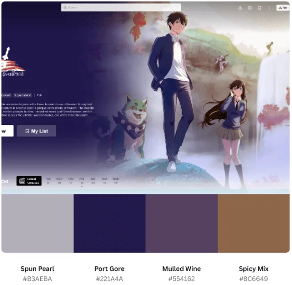
In this color combination for a website post, we unveil Bilibili, often referred to as B站 (B-Station) in Chinese, a popular video-sharing website based in China. With a focus on anime, manga, and gaming (ACG) content, Bilibili has progressively expanded to encompass a diverse range of categories, including music, dance, science and technology, lifestyle, and more. The website’s primary color palette features Spun Pearl (#b3aeba), Port Gore (#221a4a), Mulled Wine (#554162), and Spicy Mix (#8c6649). These swatches inspire maximum aesthetics in your graphic and web design projects, increasing engagement and showcasing innovative, successful prototypes.
2.) Roblox
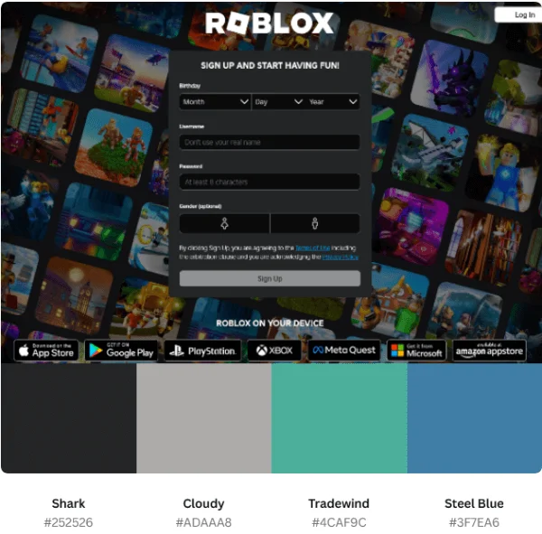
Roblox has grown into a massive virtual world with millions of user-generated games and experiences, combining elements of social media, game development, and esports into a single platform. In this color palette example, earthy sandy tones add a sense of stability and warmth, with Shark (#252526) providing a strong foundation. Cloudy (#adaaa8) enhances readability, while touches of Tradewind (#4caf9c) and Steel Blue (#3f7ea6) introduce pops of colour, boosting engagement. This coloration unveils a blend of aesthetics and innovation, inspiring creators to tailor successful prototypes that unlock maximum potential, starting from scratch and enhancing both UI and UX.
3.) Max
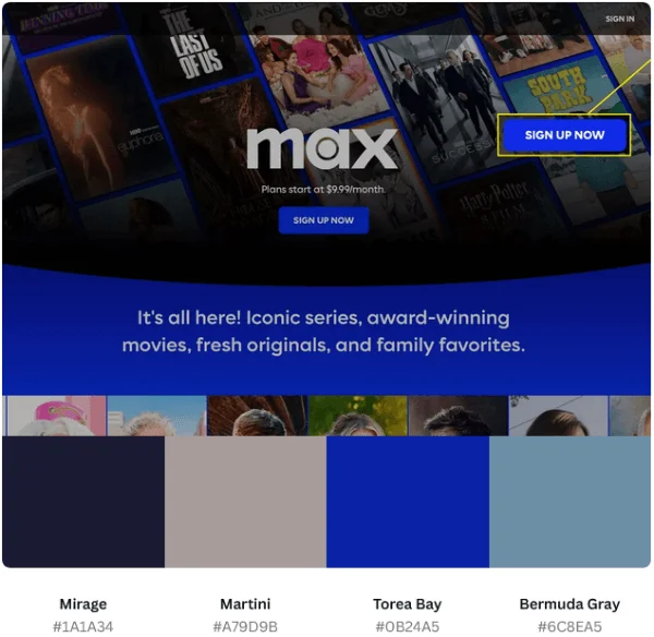
Max, the rebranded identity of HBO Max across various regions, epitomizes subscription video-on-demand excellence. The selected web design color scheme, featuring Mirage (#1a1b34), Martini (#a9a1a1), Governor Bay (#2a45a5), and Bali Hai (#7895ac), perfectly suits a website showcasing monochromatic sculptures, blending classic elegance with timeless style. This exquisite arrangement isn’t just about aesthetics but also leverages artificial intelligence in coloration, aligning seamlessly with brand standards and current trends. Its psychological impact and trendiest appeal make it a favorite among designers, highlighting Max’s commitment to both artistry and user engagement.
4.) Home Depot
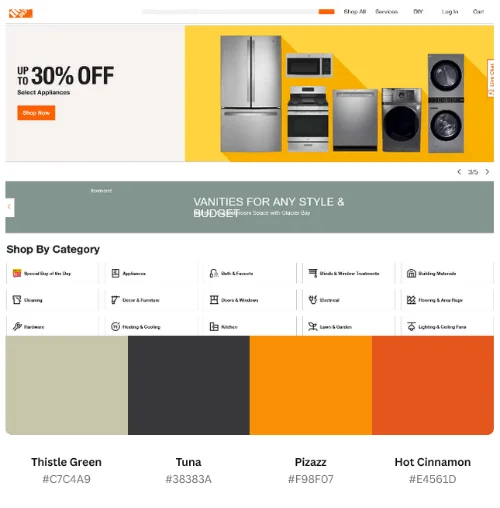
Home Depot showcases its eCommerce prowess through a carefully curated color combination for their website. With a palette featuring Thistle Green (#c7c4a9), Tuna (#38383a), Pizazz (#f98f07), and Hot Cinnamon (#e4561d), they achieve a striking balance of contrast and consistency. This choice not only aligns perfectly with their brand identity but also leverages the psychological impacts of color pairings. From industrial tools to luxurious furniture, each product category on their platform benefits from this creative mockup of colors, setting new standards in online shop interface design. Inspired by both trends and consumer preferences, Home Depot’s color developers have crafted an interface that’s as functional as it is visually engaging, making browsing and purchasing a seamless experience.
5.) Chase Bank
Incorporating Mariner (#2574bd), Mischka (#cfd5db), Dell (#3b6d14), and Cornflower (#8cbce4), this stunning color combination is perfect for projects aiming to exude vibrancy and professionalism, akin to Chase Bank’s meticulous web design color schemes. Ideal for cryptocurrency platforms, marketing firms, recruiting agencies, financial advisors, and more, these colors harmonize brilliantly to enhance engagement and clarity across print media, graphic to web design transitions. Whether you’re a beginner or seasoned decorator, these color palette supercharge visual appeal and pattern compatibility, making any design truly awesome and impactful.
6.) The Sun
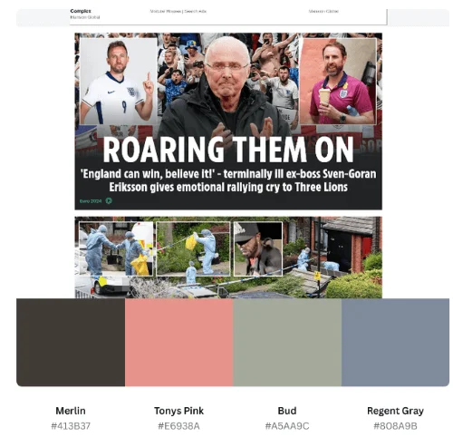
In this striking color combination for website design, ‘The Sun’ stands out with a simple yet powerful red arrangement that enhances the clarity and readability of each element. The palette includes Merlin (#413b37), Tonys Pink (#e6938a), Bud (#a5aa9c), and Regent Gray (#808a9b), creating a minimalist and professional look. The contrast between the warm tones and cool grays not only ensures compatibility across various media but also captivates with its appealing pattern and professional aesthetic. This design seamlessly transitions from print media graphics to web design, making it a standout choice for any project requiring a bold, contemporary look.
7.) Met Office
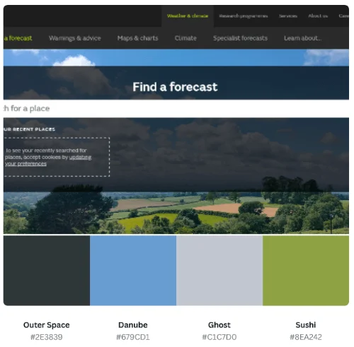
The Met Office’s web design exemplifies a blend of functionality and aesthetic appeal tailored for weather information dissemination. With a clean and intuitive interface, their website prioritizes user experience, ensuring easy navigation and quick access to meteorological data. The colour scheme, featuring calming grey, blue, alongside informative Ghost (#c1c7d0) and Sushi (#8ea242), reflects the dynamic nature of weather patterns while maintaining clarity and readability. This noteworthy and trendsetting theme offers an incredible and unique design, making it a valuable resource with good color combinations for websites.
8.) Bunnings
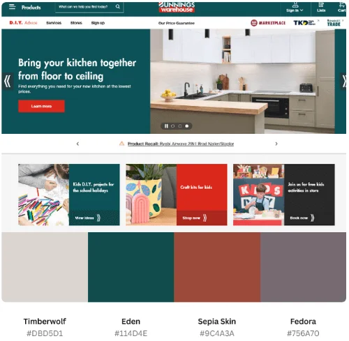
Bunnings’ web design is a testament to user-centric principles, focused on providing a seamless and efficient shopping experience. The website’s color combination, featuring Timberwolf (#dbd5d1), Eden (#114d4e), Sepia Skin (#9c4a3a), and Fedora (#756a70), creates a palette that is both genuine and inventive. These colors are complemented by neutral backgrounds and ample white space, enhancing readability and focus. The use of consistent typography and button styles across the site contributes to a cohesive and professional look.
9.) Kmart Australia
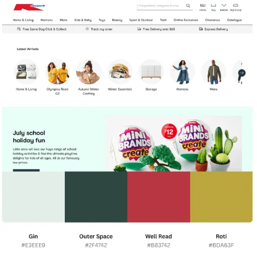
Kmart is a well-known retail chain offering a wide range of products at affordable prices, complemented by its beautiful web design architecture. Originating in the United States, Kmart operates numerous stores in Australia, providing customers with various items including clothing, electronics, fashion, home goods, toys, and more. The color scheme of Gin (#e3eee9), Outer Space (#2f4742), Well Read (#b83742), and Roti (#bda63f) creates a genuine and definitive aesthetic. These inventive pairings make for a noteworthy and gainful design, swiftly capturing attention and setting a recipe for the hottest and most engaging user experience.
10.) Vodafone
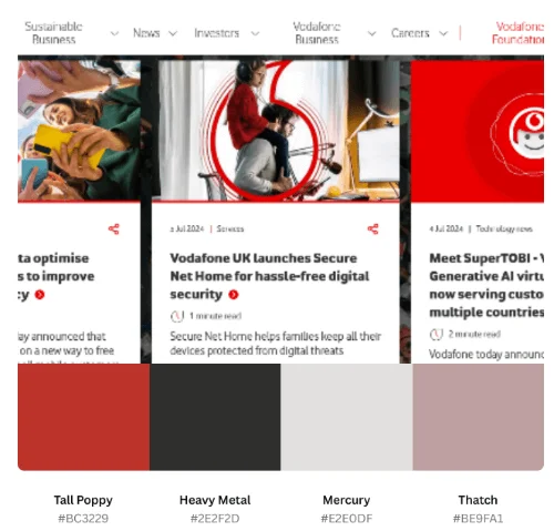
Vodafone serves as the digital hub for the global telecommunications giant, offering customers and businesses a comprehensive platform to explore and manage a range of services including mobile plans, smartphones, broadband, and Internet solutions. The website utilizes a color scheme that draws users’ attention and encourages action, prominently featuring a powerful red alongside Carbon Fiber (#2e2f2d), Christmas Silver (#e2e0df), and Foggy Quartz (#be9fa1). Consistency in these colors enhances brand recognition and usability, evoking user emotions and reinforcing Vodafone’s commitment to efficiency and brilliance in delivering deals and retail store experiences.
11.) BIG W
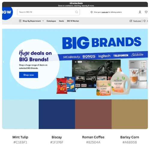
BIG W, Australia’s beloved discount department store chain, boasts a vibrant online retail storefront catering to families and individuals seeking affordable shopping options. Offering a diverse range of products including women’s fashion, kids’ clothes, shoes, jewelry, accessories, and furniture, BIG W ensures accessibility and variety. The website’s color scheme features light sky (#c1e8f1), blue (#1f376f), coffee (#82504a), and brown (#a6895b), creating a harmonious and eye-catching palette. These color pairings not only enhance usability but also reflect contemporary fashion trends, making BIG W’s online presence both extraordinary and user-friendly.
12.) The Age

The Age exemplifies the art of color pairing and harmony with its sophisticated use of Ebony Clay (#21263a), Cold Turkey (#c8b8b2), Regent Gray (#8593a5), and Denim (#1955ba). These carefully selected hues from the color wheel are masterfully arranged throughout the site’s layout, creating an eye-catching and responsive interface. Whether uncovering investigative journalism or presenting opinion pieces, the colors not only enhance readability but also evoke a sense of elegance and clarity. This fashionable colour combination, guided by principles of color theory and thoughtful arrangement, providers a beautiful website experience. It reflects The Age’s commitment to mastering the art of content engagement through skillful handling of color and layout.
13.) Mercado Libre Crafting the Ideal Web Color Palette
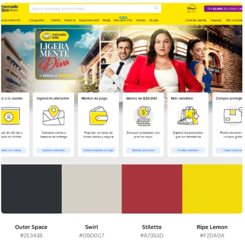
Mercado Libre’s website design exemplifies strategic color contrast and consistency, crucial for marketplace success. Against a backdrop of Outer Space (#2e3438), the palette utilizes Swirl (#d5d0c7) to uncover a seamless user experience, aligning effortlessly with their brand identity. Accent hues like Stiletto (#a7353d) and Ripe Lemon (#f2da0a) strategically highlight key elements, ensuring visual hierarchy and usability. This thoughtful application of colors not only enhances user engagement but also aligns with psychological principles of trust and reliability, distinguishing Mercado Libre as one of the top eCommerce platforms in Latin America.
14.) Der Standard
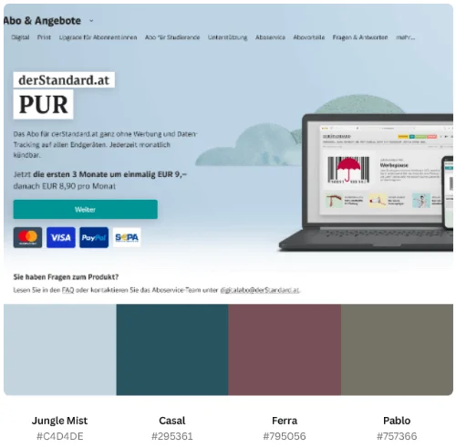
Der Standard’s website design achieves top-tier functionality with a sophisticated color harmony that prevents it from becoming a useless website. Using a palette dominated by Jungle Mist (#c4d4d) and Casal (#29536), the site balances professionalism with a modern aesthetic. Subtle accents of Ferra (#79505) and Pablo (#757366) enhance readability and highlight key content areas, ensuring a real impact for their journalistic coverage. This thoughtful approach to color and design supports Der Standard’s reputation for thorough reporting and user-friendly menu system, thriving as a go-to platform for Austrian and global news.
15.) Joyas
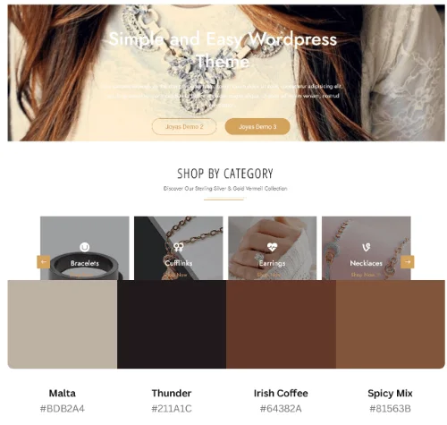
Joyas is a trendy and gorgeous WordPress theme tailored for diverse industries like men’s t-shirt stores, perfume shops, jewelry, apparel, glass frames, and watch industries. Its design strikes a balance between minimalism and impact, making it ideal for beginners seeking inspiration. The color contrast blends accent hues with neutral tones, ensuring consistency and brand alignment throughout the site. This approach not only follows current trends in web design color combinations but also considers the psychological impact of colors on user engagement.
16.) Planos TIM
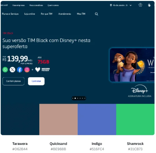
Planos TIM showcases the superb range of mobile and data plans offered by TIM (Telecom Italia Mobile), a trusted telecommunications provider in Brazil. Customers encounter a variety of options, including prepaid, postpaid, and control services, designed to meet diverse needs with genuine and enduring pairings of data, voice minutes, and text messages. The announcement of these plans highlights their simple yet effective structure. By utilizing primary and secondary colors within the RGB and CMYK colour models, the plans are presented with excellent contrast and brightness, ensuring clarity and appeal for users.
17.) Le Robert
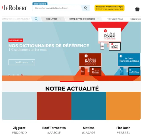
Le Robert, a renowned French publishing company, is celebrated for its comprehensive dictionaries and reference works essential for mastering the French language. In designing a website for Le Robert, a thoughtful color palette should be created to reflect the educational focus and sophistication of its learning and tutor books. Utilizing complementary, analogous, and monochromatic colors can enhance the visual appeal. Warm colors might evoke a sense of encouragement and creativity, while cool colors offer calmness and clarity. The arrangement of these colors will ensure a cohesive and engaging online experience, aligning with the company’s esteemed reputation.
18.) Chilexpress
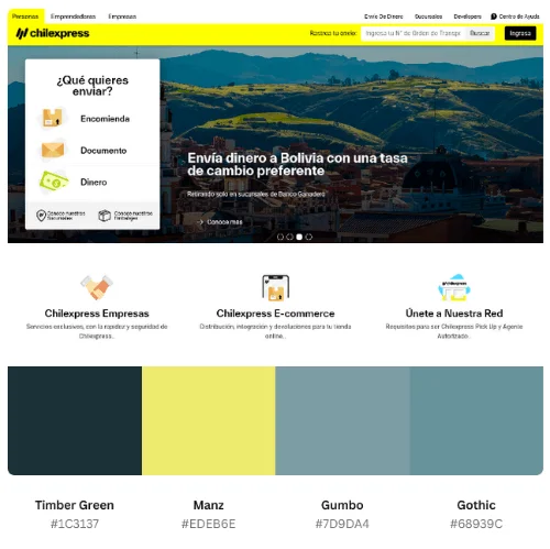
Chilexpress, a top-notch courier and logistics company in Chile, excels in parcel delivery, aviation, and shipping solutions. To create a website color palette similar to Chilexpress, incorporating the hues of Timber Green (#1c3137), Manz (#edeb6e), Gumbo (#7d9da4), and Gothic (#68939c) can elevate the UI and UX. These web design color schemes, chosen for their saturation, shade, and tint, provide a balanced palette that reflects reliability and efficiency. By carefully arranging the primary and secondary colors on the colour wheel, the design enhances user engagement and navigation, ensuring a seamless experience for customers searching for shipping and car renting solutions.
19.) Chevignon
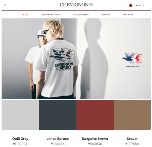
Chevignon’s design ethos epitomizes a harmonious balance of rugged elegance and urban chic, reflected vividly in its color palette. Dominated by Quill Gray (#cfcfce), the tones evoke a sense of industrial strength and urban resilience, resonating with the brand’s warehouse-inspired aesthetic. Complementing this base, Limed Spruce (#384146) adds a touch of sophistication, akin to the meticulous craftsmanship seen in its apparel lines. Sanguine Brown (#8a3836) infuses warmth and depth, symbolizing the brand’s deep-rooted success and timeless appeal.
Finally, Beaver (#92755a) completes the palette with its earthy hue, embodying Chevignon’s commitment to quality and exclusive allure in the competitive fashion landscape. This carefully curated blend of analogous colors creates a monochromatic harmony that aligns perfectly with Chevignon’s brand identity, driving inspiration and setting it apart as a leader in men’s fashion worldwide.
20.) eMart
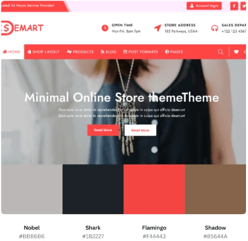
eMart, a WooCommerce template, epitomizes versatility with its dynamic colour scheme and design philosophy. Red (#bbb6b6) serves as the foundation, offering a neutral backdrop that enhances product visibility across diverse categories like boutique apparel, auto parts, agriculture items, gardening tools, and eyewear. Contrast is boldly achieved with Black (#1b2227), adding depth and highlighting product details with precision, much like the meticulous RGB values used in digital imaging. Glowing Brake Disc (#f44443) injects vibrancy, symbolizing the energy and innovation inherent in eMart’s layout and functionality. Shadow (#85644a) contributes warmth and richness, akin to the CMYK color model’s depth in print media. This complementary blend of colors not only enhances the aesthetics but also inspires seamless browsing experiences across varied shopping activities, making eMart a superior choice for anyone seeking a robust and visually captivating online storefront.
21.) Canva
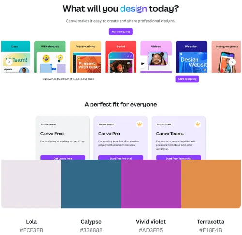
Canva employs a sophisticated hue scheme characterized by striking contrasts and complementary hues. The background hues like Lola (#ece3eb) and Terracotta (#e18e4b) provide a balanced canvas against which the vibrant accents of Calypso (#336888) and Vivid Violet (#ad3fb5) pop with vivid intensity. This contrast not only enhances the aesthetics but also ensures readability and visual appeal across various design elements. Canva’s design style seamlessly integrates these colors within its layouts, offering users a blueprint for creating visually captivating graphics that stand out in both digital and print formats. With carefully curated templates, photos, icons, and fonts, Canva enables users to achieve clear readability and perfect showcase their ideas.
22.) Tokmanni
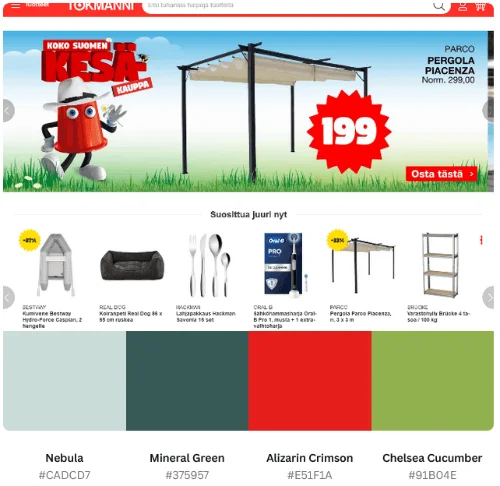
Tokmanni’s brand identity is reflected in its strategic use of color contrast and design principles. The company employs a palette that blends subtle backgrounds with vibrant accents, echoing its commitment to affordability and diversity. The contrast between neutral tones and occasional pops of vivid colors mirrors Tokmanni’s inclusive approach, appealing to a wide demographic of budget-conscious shoppers. This aesthetic not only enhances the shopping experience but also underscores Tokmanni’s commitment to offering comprehensive product ranges that cater to diverse household needs. Through strategic typography and clear layout structures, Tokmanni effectively communicates its brand values of sustainability and community engagement, setting a clear guideline for future retail trends in Finland.
23.) leDénicheur
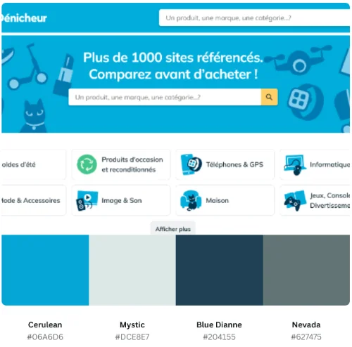
LeDénicheur’s design palette blends Cerulean (#06a6d6), Mystic (#dce8e7), Blue Dianne (#204155), and Nevada (#627475) to create a visually striking contrast that reflects its innovative approach to price comparison. Cerulean adds vibrancy, symbolizing trust and reliability, while Mystic and Blue Dianne introduce clarity and sophistication. Nevada’s muted tone provides stability and professionalism. This thoughtful combination enhances the platform’s aesthetic appeal and ensures effective highlighting of essential elements like typography and structure. The overall design is seamless, creating an interface that is both beautiful and user-friendly, guiding consumers through a comprehensive shopping experience like a well-crafted wallpaper.
24.) Mannings
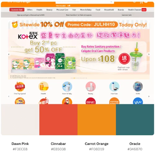
Mannings, the renowned Hong Kong chain, operates as a health and beauty retailer with a legacy dating back to 1963. Known for its extensive range of pharmaceuticals, personal care products, cosmetics, and health supplements, Mannings combines hues like soothing blues and greens in its website’s color palette. This harmonious blend creates a serene yet professional backdrop, reflecting its commitment to quality and innovation. The subtle shades and tints are carefully chosen to enhance user experience, ensuring clarity in product offerings and ease of navigation. Mannings’ design blueprint focuses on user-friendly interfaces, ensuring that customers find health and beauty essentials effortlessly.
25.) Tesco
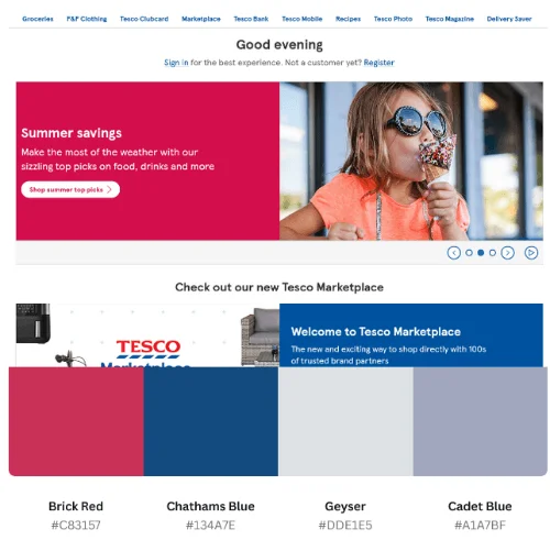
Tesco, a cornerstone of the UK retail landscape, boasts a vast network of supermarkets and convenience stores globally. The company’s design palette blends hues like Brick Red (#c83157), Chathams Blue (#134a7e), Geyser (#dde1e5), and Cadet Blue (#a1a7bf) to create a visually engaging and trustworthy shopping experience. These colors evoke a sense of reliability and accessibility, reflecting Tesco’s commitment to quality and customer service excellence. The palette’s subtle shades and tints enhance product visibility and navigation, ensuring that Tesco remains a preferred destination for millions worldwide seeking value and convenience in their shopping journeys.
26.) Coolors

Coolors.co, an authentic and top-tier color combination website, offers an incredible tool for generating and exploring colour palettes. Designed with a lovely and user-friendly UI, it’s perfect for designers, artists, and anyone working with color. The magic of Coolors.co lies in its ability to create unique palettes using colors like Cold Turkey (#d1bfb8), Tarawera (#0a3d5b), Medium Red Violet (#ce349a), and Ripe Lemon (#f2d016). Users can experiment with monochromatic, analogous, and complementary schemes, making it an invaluable resource for education and premium design layouts.
27.) Visme

Visme sets the standard with its best gradient color combinations for websites, offering an innovative platform for creating visually stunning presentations, infographics, and reports effortlessly. With colors like Astral (#3779ad), Mischka (#dadce1), Red Damask (#df8c45), and Amethyst (#a55bc6), Visme combines minimalistic styling with diverse tone theory applications. These complementary palettes not only enhance visual appeal but also support effective data visualization and animation, making Visme ideal for both consulting projects and hardware-related content creation.
28.) Squarespace

Squarespace exemplifies simple and clean color contrast in this color combination website finder post. Renowned for its intuitive platform, Squarespace offers a versatile array of customizable templates and responsive designs. With colors like Swiss Coffee (#e1dcdb), Eclipse (#2d1d15), Zorba (#9f9794), and Hurricane (#8c8385), Squarespace balances aesthetic appeal with functional design. Ideal for entrepreneurs and small businesses, it provides powerful tools for e-commerce, blogging, and content management, ensuring a polished web presence that resonates in today’s digital environments.
29.) GraphicMama

GraphicMama’s web color palette idea is exemplified by its layout, designed to inspire creativity. Founded with a mission to simplify the creative process, GraphicMama offers a vast collection of high-quality vector illustrations, icons, characters, and design templates. Colors like Portage (#8dabe9), Driftwood (#b7864f), Eastern Blue (#1c84ac), and Plum (#88306f) are carefully curated to enhance visual appeal and usability. These trending palettes serve as a daily example of how color choices can inspire better design outcomes, making GraphicMama a go-to resource for professionals seeking alternative layouts and fresh ideas.
30.) 10Web

10Web’s design emphasizes a classic and elegant aesthetic with its pure black and white color scheme. As a comprehensive WordPress platform, 10Web integrates hosting, a website builder, plugins, themes, and automated maintenance services into one streamlined package. This simplicity in color, staying true to black and white tones, underscores its commitment to clarity and professionalism. By maintaining a neutral palette, 10Web ensures visual consistency and brand alignment, appealing to both beginners and experienced users seeking an intuitive and cohesive web experience. This timeless approach not only enhances usability but also reflects 10Web’s dedication to timeless design principles and user-focused functionality.
Summary of Color Combination for Website
In the dynamic world of online business, leveraging a robust CMS like WordPress, Shopify, or Drupal is foundational, but it’s only the beginning. The true key to unlocking business success lies in crafting a UI/UX design that captivates and converts. Clean color contrasts are not just aesthetic choices; they are essential elements that guide user interactions and enhance usability. A well-designed web color palette isn’t just fashionable—it’s the blueprint for an awesome online presence.
Consider the impact of minimalist techniques in web design color schemes. Each combination for your website acts as a solid foundation, inspired by creative examples that follow simple yet effective patterns. Whether you’re aiming for a streamlined structure or a vibrant grid layout, these 30 excellent color schemes offer a diverse palette to suit every niche. Embrace the production of an engaging user experience through thoughtful color selection, ensuring your site stands out with its distinctive and memorable visual identity.

