The best minimalist website examples prove that a page doesn’t need to shout to be remembered. One clear headline, generous margins, a single strong image and an obvious next step can do more for a visitor than a screen packed with banners, badges and pop-ups. That is the whole idea behind minimalist web design, and it is why the style has travelled from art-school portfolios to the homepages of the world’s biggest brands.
This guide collects 20 minimalist website design examples that show how different the “less is more” approach can look. You’ll find household names such as Apple, Google, Spotify, Dropbox and Nike, plus independent photographers, a pianist, creative studios, a juice brand and a Brooklyn home-goods shop. For every site you’ll get the layout and theme, the features that keep it clean, where the approach works best, and one technique worth borrowing.
After the list, we break down the principles behind these minimalist design website examples (white space design, simple typography, a limited colour scheme, visual hierarchy), show where to find more simple design websites in the best web galleries, and finish with a practical checklist for building the look on WordPress and WooCommerce.
What Is a Minimalist Website?
A minimalist website keeps only the elements that help a visitor reach a goal and removes everything else. The result is an uncluttered homepage with a clean layout, restrained colour, simple typography and a clear visual hierarchy. “Minimal” does not mean “empty”. Every pixel that remains has a job, and the space around it is part of the design.
The idea has deep roots. Nielsen Norman Group traces web minimalism back to a mid-century art movement and to the early 2000s, when designers, photographers and architects were the first to strip their sites down. The same research group later studied 112 minimalist sites and found that they tend to share five traits: flat design, limited colour schemes, few interface elements, generous negative space and dramatic typography. You will spot all five in the examples below.
Minimalism is also a usability principle. It sits in the classic list of usability heuristics as aesthetic and minimalist design: interfaces should not carry information that competes with what matters. The gallery curators at Awwwards describe the same thing from a visual angle, naming balance, alignment and contrast as the three fundamentals of minimal design.
Put those ideas together and you get a simple test for any page: if you remove an element and nobody misses it, it should not have been there.
Minimalist Website Examples at a Glance
Here is a quick comparison of all 20 examples, so you can jump straight to the style that fits your project. The “Built with” column shows the platform where it is publicly visible.
| # | Website | Type | Built with | Signature move |
|---|---|---|---|---|
| 1 | Apple | Consumer brand | Custom | One product, one message per screen |
| 2 | Search tool | Custom | A single search field on white space | |
| 3 | Spotify | Streaming service | Custom | Bold type and a tight colour scheme |
| 4 | Dropbox | SaaS | Custom | One illustration and one sentence per section |
| 5 | Nike | Sports e-commerce | Custom | Full-bleed photography and a monochrome interface |
| 6 | Paco Coursey | Personal site | — | Name-led layout with minimal navigation |
| 7 | Finnova | Manufacturer | WordPress + Elementor | Three-point value row and clean product cards |
| 8 | Mogutable | Home goods shop | Shopify | Neutral backgrounds and object-first photography |
| 9 | Embacy | Design agency | Webflow | Four-item menu and monochrome client logos |
| 10 | Minimal Gallery | Web gallery | WordPress | Every entry gets the same simple treatment |
| 11 | Koox | Juice brand | Shopify | Numbered products and a 100% / 0% claim block |
| 12 | Miro | Design software (archived) | — | Short statements and large product visuals |
| 13 | Kickpush | Product design studio | Next.js + Contentful | Three menu links and a copy-to-clipboard email |
| 14 | Shohei Takenaka | Photographer | WordPress | Six image tiles as the whole homepage |
| 15 | KUYA | Creative agency | Custom | Flat colour and lightweight vector animation |
| 16 | Kayla Arianne | Model portfolio | Pixpa | Photography does all the talking |
| 17 | Kim Dero | Branding studio | Framer | Oversized wordmark and a short project list |
| 18 | Ikin Yum | Photographer | Pixpa | Two-item menu and portfolio-first homepage |
| 19 | Ashish Chawla | Photographer | Pixpa | Full-width image sequence |
| 20 | Stefano Greco | Concert pianist | WordPress | Quote-led hero and a calm content hierarchy |
1. Apple
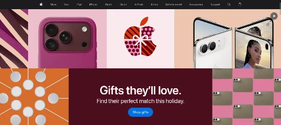
Apple’s website is the textbook minimalist website example at global scale. Each section is built around one product, one short line of copy and one huge, perfectly lit image. A slim navigation bar sits across the top, product pages repeat the same rhythm, and plain white or near-black backgrounds keep colour for the products themselves.
- Full-width hero image layout with a single headline and two small text links
- Slim global navigation that never competes with the content
- Clean sans-serif typography scaled into a clear visual hierarchy
- Subtle scroll animations that reveal detail without adding clutter
Scope of use and best for: consumer hardware, software and any premium product where the object itself is the selling point.
What to steal: give every scroll section exactly one job. If a section needs two messages, split it into two sections.
2. Google
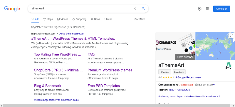
Google proves that a page can be one of the most visited places on the internet and still be almost blank. The homepage is a logo, a single search field and a few small links tucked into the corners. Nothing animates for attention, nothing asks you to read, and the result is a page that loads almost instantly.
- Centred layout with a single focal point
- Huge amounts of white space that make the search box impossible to miss
- Almost no navigation, because the tool is the navigation
- Lightweight code, so the page feels instant on any device
Scope of use and best for: utilities, search tools, calculators, converters and any product with one dominant action.
What to steal: if your site does one thing, put that one thing in the middle of the screen and let everything else get out of the way.
3. Spotify
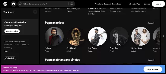
Spotify’s marketing pages show that minimal design can be loud. Instead of decoration, the site leans on big type, confident blocks of colour and a tightly limited palette anchored by the brand’s signature green and black. Each section carries one headline and one dominant button, so a visitor always knows what to do next.
- Oversized headlines that act as the main visual element
- Limited colour scheme built around a single accent colour
- One primary call to action per section
- Product imagery used sparingly, so the music and the message lead
Scope of use and best for: consumer subscriptions, apps and brands that want energy without visual noise.
What to steal: pick one accent colour and use it only for the thing you want people to click.
4. Dropbox
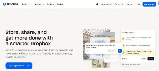
Dropbox treats every scroll section like a slide in a presentation. Each block pairs one friendly illustration with a short piece of copy about one feature, and the colour changes from section to section without ever piling more than a couple of tones into the same block. It explains a complex product without a single dense paragraph.
- Large illustrations that replace busy screenshots
- Short copy blocks, one feature per section
- Flat UI design with soft, friendly colour fields
- A short navigation menu and a simple pricing layout
Scope of use and best for: SaaS and cloud products that need to make something technical feel approachable.
What to steal: draft your page as a slide deck first. If a section can’t be summed up as one headline plus one visual, it’s too complicated for a minimal layout.
5. Nike
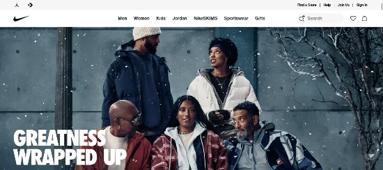
Nike runs a huge online store, yet its pages feel closer to a magazine than a catalogue. The interface is almost entirely black and white, which means the colour you notice comes from the shoes, the kit and the athletes. Large photography fills the screen, headlines are short and bold, and product grids use consistent image sizes so browsing feels orderly.
- Monochromatic colour palette for the interface, with colour reserved for products
- Full-bleed hero image layout with a short, punchy headline
- Uniform product grid with consistent photography
- Confident, high-contrast typography that stays readable at any size
Scope of use and best for: fashion, sportswear and any simple e-commerce website where product photography is the strongest asset.
What to steal: keep the interface neutral and let your products be the only colourful thing on the page.
6. Paco Coursey
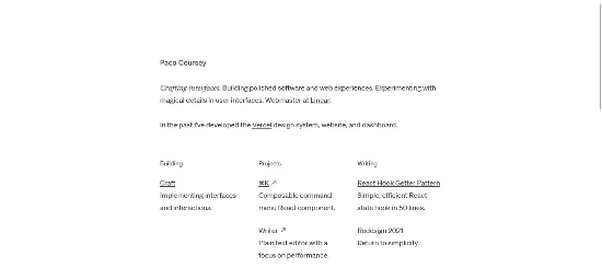
Paco Coursey is a great example of a minimalist personal website that puts the individual and their work first. The homepage starts with his name and a short professional introduction, followed by carefully organized sections for projects, writing and personal updates. Its simple typography, spacious layout and straightforward navigation make it easy for visitors to explore his work without unnecessary distractions.
- Name-led homepage with a short professional introduction
- Clean typography and generous whitespace
- Organized sections for projects, writing and personal updates
- Simple navigation with an emphasis on content
Scope of use and best for: freelancers, developers, designers, consultants and creative professionals building a personal brand or portfolio.
What to steal: organize your personal website around a few meaningful sections. A short introduction, selected projects and writing archive can communicate your professional identity without a complicated layout.
7. Finnova
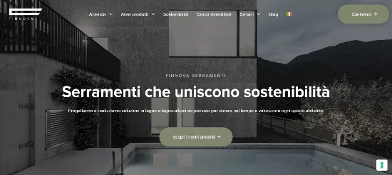
Finnova is an Italian manufacturer of wood and wood-aluminium windows and doors, and its WordPress site proves that a traditional industrial company can look refined. The top of the page is a calm photograph, a short headline about combining design, performance and sustainability, and one button. A three-point row then explains the company’s strengths with small icons and two lines of copy each.
- Clean layout built on WordPress with Elementor
- Three-point value row with small icons and short copy
- Product cards for each window range with a single link each
- One bold statistic about renewable energy instead of a wall of sustainability text
- Italian and English versions, handled without cluttering the header
Scope of use and best for: manufacturers, B2B suppliers and companies with dealer networks that need to look premium and stay easy to navigate.
What to steal: turn one proud claim into a single large number. It is faster to read than three paragraphs.
8. Mogutable
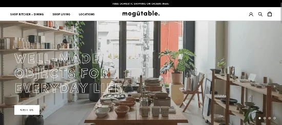
Mogutable is a Williamsburg, Brooklyn shop selling handmade ceramics, tableware, candles and incense, and its Shopify store feels like walking into the physical space. Backgrounds stay neutral, photography is large and quiet, and the brand line, “Well-Made Objects for Everyday Life”, tells you the whole philosophy in a few words.
- Neutral background colours that let ceramics and glazes stand out
- Two simple mega-menu groups, Kitchen + Dining and Living
- Large, uncluttered product photography with plenty of white space
- Curated collections instead of a long list of categories
Scope of use and best for: design-led retail, home decor, gifts and any curated shop with a small, well-chosen catalogue.
What to steal: group products into a few thoughtful collections rather than showing every category at once.
9. Embacy

Embacy is a branding and web design agency for tech companies, and its own website follows the advice it gives clients. The menu has only four items (Services, Agency, Works and Contacts), the headline states the offer in one sentence, and the portfolio is a clean list of client names and countries rather than a grid of thumbnails fighting for attention.
- Four-item navigation menu
- Project list set as simple text links with a short descriptor for each
- Client logos shown in a single flat colour, with the colour appearing on hover
- Built on Webflow, so interactions stay smooth and lightweight
Scope of use and best for: design studios, consultancies and startup service providers that need to look sharp and credible. For more layout inspiration in this space, see these business website layout examples.
What to steal: mute your client logos to one colour so they read as proof, not decoration.
10. Minimal Gallery
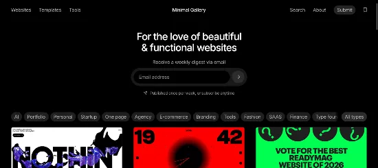
Minimal Gallery is a curated collection of website designs that makes finding web design inspiration simple. Each entry showcases a website with screenshots and a direct link, allowing visitors to explore real-world designs without unnecessary distractions. Its clean presentation, search functionality and category filters make it easy to discover websites across different styles and industries.
- Consistent screenshot-based presentation for every website
- Search and category filters for discovering relevant designs
- Clean layout that puts website previews first
- A growing collection of curated website inspiration
Scope of use and best for: web design galleries, inspiration directories, design showcases, creative portfolios and website resource libraries.
What to steal: make every listing follow the same visual format. Combine website screenshots, short descriptions and direct links to create a gallery that visitors can browse easily.
Check It Now (Minimal Gallery)
11. Koox
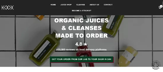
Koox is a London brand selling organic, cold-pressed juices and cleanses, and its Shopify store keeps the message as clean as the product. The homepage leads with “organic juices and cleanses made to order”, then backs it up with a simple block of claims: 100% organic, cold-pressed and raw, and 0% additives and pasteurisation. A review score from delivery platforms adds social proof in one line.
- Bold claim block that uses large numbers instead of paragraphs
- Numbered product names (N°5, N°3, N°15) that keep the catalogue tidy
- Two main collections, Cleanses and Juice Shop, so shoppers never feel lost
- Large product imagery on a soft background
Scope of use and best for: food and drink, wellness and subscription-style products with a short, clear range.
What to steal: naming products with numbers or short codes keeps menus, grids and cards beautifully short.
12. Miro
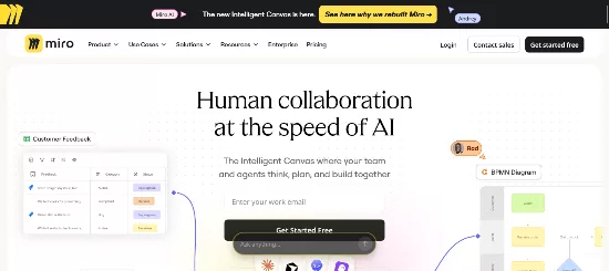
Miro is a great example of how a software company can present a complex collaboration product through clear messaging and engaging visuals. Its website combines large product screenshots, concise headlines and customer testimonials to explain how teams can brainstorm, plan and collaborate in one shared workspace. The spacious layouts and strong visual hierarchy make it easier for visitors to understand the platform without getting overwhelmed by lengthy feature descriptions.
- Large product visuals demonstrating collaboration tools in action
- Short, benefit-focused headlines instead of lengthy descriptions
- Customer testimonials and success stories that build trust
- Well-organized product sections with generous whitespace
Scope of use and best for: SaaS companies, collaboration tools, software startups and digital products that need to explain complex features through a clean marketing website.
What to steal: demonstrate your product visually instead of relying entirely on text. Combine clear screenshots, concise headlines and customer testimonials to communicate your product’s value quickly.
13. Kickpush
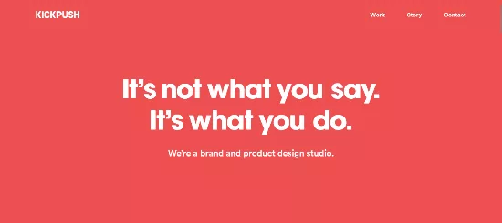
Kickpush, a brand and product design studio, shows how little a creative studio homepage really needs. A dark background, one confident headline, three menu links (Work, Story and Contact) and a few short promises about how the team works. That’s it. There’s no slider, no grid of thumbnails and no pop-up, and yet the studio’s personality comes through clearly.
- Minimal navigation menu with only three links
- Dark, high-contrast layout with large, readable type
- Copy-to-clipboard email address, a tiny micro-interaction that saves a step
- Lightweight page built with a modern JavaScript framework and a headless CMS
Scope of use and best for: design studios, product teams and freelancers who want a brand site that feels confident rather than crowded.
What to steal: let a visitor copy your email with one click. Small conveniences feel more premium than big effects.
14. Shohei Takenaka
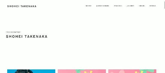
Shohei Takenaka’s homepage is a tidy set of six image tiles, one each for Works, Advertisement, Portrait, Journey, Onion and Profile. Each tile shows a single photograph with the section name and the date of the latest update, which turns the whole page into a menu and a portfolio at the same time. The advertising section carries campaign work for well-known Japanese brands.
- Image-led homepage with only six tiles
- Small, tidy typography that mixes Latin and Japanese characters
- Update dates under each tile, so returning visitors see what is new
- A custom WordPress theme that keeps the structure simple
Scope of use and best for: photographers, illustrators and artists who need a minimalist portfolio showcase. If you’re building one, these portfolio WordPress themes are a good starting point.
What to steal: make your homepage double as your navigation. Six well-chosen tiles can replace a menu entirely.
Check It Now ( Shohei Takenaka )
15. KUYA
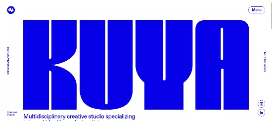
KUYA is a great example of a creative studio website that uses bold visuals and playful interactions to express its personality. Its design combines vibrant colors, distinctive typography and animated elements to create an engaging experience. Rather than relying on a conventional agency layout, the website uses creative interactions and expressive visuals to make a memorable first impression while showcasing the studio’s work and creative capabilities.
- Bold typography and vibrant colors that establish a distinctive visual identity
- Playful animations and interactive elements that add personality
- Creative visual storytelling that reflects the studio’s brand
- Portfolio presentation that highlights creative projects
Scope of use and best for: creative agencies, branding studios, design studios and independent creative teams that want a memorable website with personality.
What to steal: let your website reflect your creative personality. Combine a distinctive color palette, expressive typography and lightweight animations to make your brand memorable without overwhelming visitors.
16. Kayla Arianne
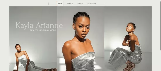
Kayla Arianne’s website is a great example of a fashion and beauty model portfolio where photography takes center stage. The homepage uses a bold, multi-image layout to showcase her modeling work, while simple navigation makes it easy for visitors to explore her portfolio and contact details. Its clean, neutral design keeps unnecessary elements out of the way, allowing photographers, agencies and brands to focus on her work.
- Image-first homepage with large fashion and beauty photographs
- Minimal navigation with clear portfolio and contact sections
- Clean, neutral interface that keeps attention on the photography
- Personal branding that creates a consistent visual identity
Scope of use and best for: fashion models, beauty models, actors, stylists and creative professionals who need a polished online portfolio.
What to steal: lead with your strongest photograph and keep navigation simple. Make your portfolio and contact information easy to find so potential clients can quickly review your work and get in touch.
17. Kim Dero
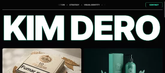
Kim Dero’s site is a branding and packaging portfolio built on a Framer template made for agencies, studios and individuals. A giant wordmark takes over the first screen, services are listed on one line with small bullets (visual identity, packaging, development, art direction and strategy), and only four projects are highlighted: La Paz, Cocoon Beauty, Vanta and Mezcla.
- Oversized typographic hero instead of an image
- Services listed as a simple line of text
- Four featured projects, each with a one-line description
- One friendly call to action in the footer
Scope of use and best for: branding studios, packaging designers and solo creatives. It’s also proof that a ready-made template can feel custom when the content is edited this tightly.
What to steal: show fewer projects. Four great ones beat twenty good ones.
18. Ikin Yum
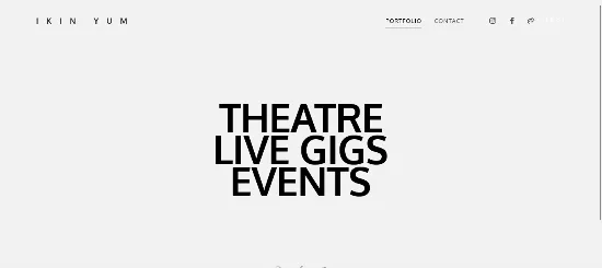
Ikin Yum is a London photographer who has built a career on weddings, theatre and live gigs, and his Pixpa website matches his stated approach of capturing moments without interfering. The main menu has two items, Portfolio and Contact. Theatre, live gigs and events sit in a small secondary list, and the portfolio is the homepage.
- Two-item navigation menu
- Portfolio as the homepage, with no separate landing page to click through
- Secondary categories grouped quietly at the bottom
- Website-builder foundation with fast, image-friendly galleries
Scope of use and best for: wedding, event and live-performance photographers who want their images to do the selling.
What to steal: skip the landing page. Make your best work the first thing a visitor sees.
19. Ashish Chawla
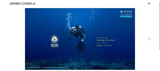
Ashish Chawla is a commercial and fine art photographer based in New Delhi, and according to his site he holds a Guinness World Record for the deepest underwater shoot. His homepage is a long, wide sequence of photographs and nothing else. The menu groups the work into Fashion and Editorial, Beauty, Portraits, Advertising, Automobile, Videos and Personal.
- Full-width image sequence that lets each photograph breathe
- Single-line category menu that doubles as a portfolio index
- A one-line credential used as the page description, not a paragraph
- Pixpa foundation for fast, simple image management
Scope of use and best for: commercial photographers, filmmakers and art directors with a broad body of work that needs clear categories.
What to steal: sort a large portfolio into short, plain-word categories instead of inventing clever labels.
Check It Now ( Ashish Chawla )
20. Stefano Greco
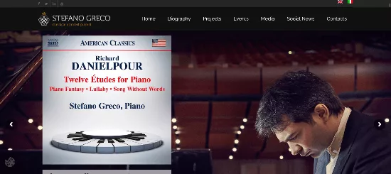
Stefano Greco is a Rome-based classical pianist, and his WordPress site shows how elegant simplicity works for an artist. The hero slides are led by short critic quotes rather than stock photography, and the menu stays short: Biography, Projects, Events, Media and Contact. Italian and English versions are available, and larger projects, such as his Goldberg Variations material, get their own dedicated microsite instead of crowding the main one.
- Quote-led hero that puts credibility first
- Short, clear menu with a logical grouping of sections
- Bilingual structure that doesn’t add visual clutter
- Dedicated microsite for a major project, keeping the main site focused
Scope of use and best for: musicians, speakers, authors and other personal brands who rely on reputation and events. One note: slider plugins add weight, so a static hero would make this approach even leaner.
What to steal: move big side projects to their own small site and link to them, instead of stuffing everything into one menu.
Check It Now ( Stefano Greco )
Web Galleries for More Simple Design Websites
Twenty examples are a good start, but inspiration works best when you can keep browsing. The best web galleries curate sites by style, which makes them ideal for finding more simple design websites that match your industry.
- Awwwards: its minimal websites gallery collects award-winning pages that put white space and balance first.
- Curated lists: our roundup of web design inspiration sites covers more places to browse by industry, layout and colour.
- Personal showcases: sites such as Minimal Gallery’s (example 10) prove a gallery can be as quiet as the pages it features.
When you browse, save screenshots by pattern rather than by site: “navigation I like”, “hero I like”, “footer I like”. Patterns transfer to your project far more easily than whole designs do.
Minimalist Design Principles You Can Steal
Look across the 20 examples and the same moves keep appearing. Here are the principles behind the best minimalist design website examples, with a practical way to apply each one.
1. Use white space as a design element
White space design is not wasted space. It separates ideas, sets reading rhythm and tells the eye where to look first. Most designers err on the side of too little. As a rule of thumb, increase the padding between sections until it feels slightly too generous, then keep it.
2. Keep typography simple
Most of these sites use one typeface family, sometimes two, and create variety through size and weight. A clean sans-serif is the safest choice for body text, and one dramatic headline size gives the page its personality. If you’re choosing fonts, start with this list of clean fonts for websites.
3. Limit the colour scheme
Aim for a neutral base, one main brand colour and one accent. Nike keeps its interface monochrome, KUYA leaned on two colours, and Spotify anchors everything to one accent. Need a starting point? Browse these web color palettes and pick a calm combination.
4. Build a clear visual hierarchy
Hierarchy tells visitors what to read first, second and third. Size, weight, contrast and position do most of the work. Apple and Dropbox both use one big headline per section, and Kim Dero turns the entire first screen into a single oversized word.
5. Use a grid-based layout
A grid makes sparse pages feel intentional instead of unfinished. Shohei Takenaka’s six tiles and Minimal Gallery’s uniform cards both rely on a strict grid. Keep image sizes and spacing identical so the pattern reads instantly.
6. Trim the navigation
Kickpush uses three links, Ikin Yum uses two and Embacy uses four. A minimal navigation menu forces you to decide what matters. If a page doesn’t earn a slot in the header, link to it from the footer or from the content.
7. Lead with one hero image or headline
A strong hero image layout does the job of a paragraph. Finnova, Ashish Chawla and Apple all open with a single dominant visual. Pair it with one headline and one button.
8. Add motion sparingly
Micro-interactions and subtle scroll animations make a minimal page feel alive: a hover state, a fade-in, a copy-to-clipboard email as on Kickpush. Keep them short and purposeful, and avoid anything that delays reading.
9. Protect page speed
Fast page speed is a natural by-product of a minimalist website, because fewer elements mean fewer requests. Protect that advantage: compress images, limit fonts and avoid heavy sliders. If you’re on WordPress, a lightweight starting point such as one of the fastest WordPress themes gives you a head start.
10. Make everything readable
High readability matters even more when there’s less to look at. Use sufficiently dark text on a light background (or the reverse), keep line lengths comfortable and make buttons large enough to tap. Contrast is one of the three fundamentals named by Awwwards for a reason.
Minimalist Website Examples by Use Case
Different projects borrow from different parts of the list. Use this map to find the closest match.
- Minimalist portfolio showcase: Shohei Takenaka, Ikin Yum, Ashish Chawla and Kayla Arianne all let photography lead. Pair the approach with a lightweight portfolio theme.
- Architectural portfolio: the same image-first, grid-based approach suits architects and interior designers. Browse these architecture WordPress themes for ready-made layouts.
- Simple e-commerce website: Mogutable, Koox and Nike show how to keep a shop calm. For a store of your own, see these minimalist eCommerce themes.
- Minimalist agency website: Embacy, Kickpush and KUYA show how to look confident with a short menu and a short project list.
- Creative studio site: Kim Dero proves that an oversized wordmark and four projects are enough.
- Modern landing page design: Apple, Dropbox and Spotify show the one-idea-per-section pattern that suits conversions.
- Minimal personal blog: Paco Coursey and Stefano Greco show how a name, a short menu and a readable text column can carry a personal brand.
How to Build a Minimalist Website on WordPress and WooCommerce
Several examples above, including Finnova, Shohei Takenaka, Minimal Gallery and Stefano Greco, are built on WordPress, which shows that you don’t need a custom stack to get this look. Follow this step-by-step process.
- Define the one job of your homepage. Sell a product, book a call or show a portfolio. Write it as a single sentence and judge every element against it.
- Pick a lightweight theme. Choose a theme with a clean layout, flexible white space and few built-in extras. Block themes and fast classic themes both work well.
- Set your design tokens first. Choose one or two fonts, a neutral background, a dark text colour and one accent. Apply them globally so every page matches.
- Reduce the menu to the essentials. Aim for three to five links, and move the rest to the footer.
- Use big, honest imagery. One high-quality hero image is stronger than a slider of four mediocre ones. Compress it before uploading.
- Simplify WooCommerce. Use a clean product grid with consistent image sizes, hide secondary information behind hover or tabs, and keep category lists short. Show price, name and image first.
- Cut the plugins. Every plugin that loads front-end scripts adds weight. Keep only the ones that directly support your goal.
- Test on mobile first. Minimal layouts shine on small screens, but only if tap targets are large and text is readable.
Before you publish, run through this quick checklist:
- Does the homepage have a single, clear call to action?
- Is the main navigation menu five links or fewer?
- Does the page use no more than two typefaces and three main colours?
- Is there at least as much white space as there is content?
- Is body text clearly readable on every screen size?
- Are images compressed and sized correctly?
- Can a first-time visitor explain what you do within five seconds?
Common Minimalist Design Mistakes
Minimalism is easy to get wrong. These are the mistakes to watch for.
- Hiding navigation. Tucking every link behind a hamburger icon looks tidy, but visitors may never discover what you offer. Nielsen Norman Group has long cautioned that hidden navigation can hurt discoverability, so keep the most important links visible.
- Low-contrast text. Pale grey on white is pretty and hard to read. Meet accessibility contrast guidelines (WCAG asks for a ratio of at least 4.5 to 1 for normal text).
- Confusing flat design with no signifiers. If buttons and links don’t look clickable, people hesitate. Use colour, underlines or hover states to show what’s interactive.
- Thin content. A minimal design is not an excuse for a page with almost no useful text. Search engines still need enough content to understand the page, so say what you do clearly and add supporting detail further down.
- Removing the personality. Minimal should feel intentional, not generic. One memorable typeface, colour or interaction is enough to make a site yours. For a reminder of what happens at the other extreme, see these bad website design examples.
FAQ
What are minimalist website examples?
Minimalist website examples are sites that use only essential elements: a clear headline, simple typography, a limited colour scheme, ample white space and a minimal navigation menu. The twenty sites in this guide range from global brands to personal portfolios.
What makes a good minimalist website design?
A good minimalist website has a clear purpose, strong visual hierarchy, readable text, consistent spacing and a fast load time. Every element should help the visitor reach a goal, and anything that doesn’t should be removed.
How many colours should a minimalist website use?
Most minimalist sites use a neutral base plus one or two brand colours. Nike keeps its interface monochrome, while Spotify relies on one accent colour. A 60-30-10 split between background, text and accent is an easy starting point.
Are minimalist websites good for SEO?
They can be. Fewer elements usually mean faster pages and cleaner code. The key is to avoid thin content: keep the design minimal, but give search engines and visitors enough meaningful text, headings and internal links to understand each page.
Can an e-commerce store be minimalist?
Yes. Mogutable, Koox and Nike all run online stores with calm layouts, consistent product photography, short menus and secondary information kept out of the way until it’s needed.
Which platforms work best for a minimalist website?
The examples above use WordPress, Shopify, Webflow, Framer, Pixpa and custom code. WordPress with a lightweight theme is a flexible choice, and WooCommerce lets you add a simple shop without changing the design.
Where can I find more simple design websites?
Start with curated web galleries such as the Awwwards minimal collection, then explore design inspiration lists that group sites by industry and style. Save screenshots by pattern, such as navigation, hero and footer, so you can reuse ideas easily.
What is the difference between minimalist and boring?
A boring site has no hierarchy, so everything looks the same. A minimalist site has strong hierarchy: the few elements on the page are sized, spaced and coloured to guide the eye exactly where it should go.
Conclusion
These 20 minimalist website examples prove that less really can be more. Apple, Google and Spotify do it with one message at a time. Independent photographers and designers do it by trusting their work to speak. Shops such as Mogutable and Koox do it with calm product photography and short menus. The tools differ, but the habits are the same: one clear goal, restrained colour, simple typography, generous white space and a navigation menu that never gets in the way.
Pick the two or three techniques that suit your project, apply them consistently and resist the urge to add “just one more thing”. When in doubt, take an element out and see if anyone misses it. If they don’t, you have just made your website better.